Who's behind the news?
Who's behind the news?
Data science engineer offers blueprints and tools for indie research
Ari Lamstein is a software engineer and technical trainer who builds open-source tools to help researchers and journalists analyze federal data. This interview was conducted by Morgan Kriesel on May 6, 2026.
“They could use my code [for free] as a starting off point for their own projects. That's the core of what open source means to me.”
If you were to put it into layman's terms, what does “open source” mean? Why is it useful?
It means the software is free of cost, and you can modify it, which makes it really easy to build on top of and contribute to.
All of my census-related work in Python uses a package called censusdis to talk to the Census Bureau and download data. It's made by a guy named Darren Vengroff. I could use that for free because that's an open source Python package. The Census Bureau limits you to getting data for one year at a time. That's fine, but for my purposes—I was very interested in trends, analyzing trends. That's the key feature of open source for me, is you could use anyone else's code.
And oftentimes people let you contribute code to their projects. I wrote code to make it easy to get data for a particular geography, for a particular variable over time, and I wanted to contribute it in case anyone else wanted to use it. And Darren said, “Okay.” I added it in, and now anyone else can use it. You can also modify someone else's code for your own purposes. I think that's particularly useful.
In my own recent work, I focused on making data [from the American Community Survey] more easily accessible as a time series, meaning—How have certain trends happened at certain geographies? I've been doing that through Python packages, which are useful for data analysts, and through web apps, which are useful for laymen.
I've created two very similar apps at this point, the COVID Demographics Explorer, looking at trends pre and post-COVID; and then Foreign-Born Population Trends, to measure the impact of Trump's immigration policies. But there's over 10,000 variables in the American Community Survey (ACS)—you could imagine someone wanting to do something similar for a totally different purpose. They could use my code [for free] as a starting off point for their own projects. That's the core of what open source means to me.
That's incredibly useful. I feel like as we're seeing the government step away from providing the information that it used to, a lot of the burden of analysis and collection is falling upon people donating their time, and helping each other with these projects. You would agree with that?
Yeah, just look at what DOGE did.
My next two blog posts will be about a revamped version of a COVID Demographics Explorer, which I think will be interesting, then a guide for people who want to create similar types of apps—a blueprint for creating similar types of things yourself. If you could help raise awareness of that, it would be greatly appreciated.
Yeah, there's people who are looking for tools like that. They want to take over the analysis, the data collection that is being abandoned.
Nativity App [AKA the Foreign-Born Population Trends app] relates to that.
My Nativity App has all of the ACS data on nativity, ever. It started in 2005, it goes up to the last year. So if the Census Bureau hypothetically took down the API for budget reasons, people would say, "Where can I get this data?" The nativity data is in that repo, and it's there forever.
“The purpose is to set up an infrastructure so that we can see how changes… unfold during the Trump administration.”
That was a long time ago, maybe 10 years. I was working as a software engineer at a company called Trulia, an online real estate company. And I was working with a statistician analyzing the effectiveness of our ad system. The idea was to sell real estate agents a proportion of all leads in a particular ZIP Code. Like Beverly Hills, 90210—so maybe a real estate agent wants to be notified every time someone asks to buy a house, or for information about a house, in 90210. There are a lot of details there, but the concept was that I was doing a lot of analytics based in this ZIP Code.
We had this number of people asking for, or submitting leads for, those residences and so on. And the software I was using to analyze that was called R, the R programming language, and it had no ability to make maps of ZIP Codes. It's open source, so I was able to add that functionality myself.
It wound up being pretty complicated. So I started at states and counties, and then added ZIP Codes. You want maps for that information, because they're geographical patterns that you can't see when you're looking at it as a table. That type of map that's color-coded is called a choropleth map.
I named the software package Choroplethr, which I pronounced as “choropleth-er,” like the thing that makes choropleth maps. The company [Trulia] let me open-source it, but I needed example data because I couldn't publish our data. That's when I discovered that the US Census Bureau produces a lot of data at all sorts of geographical levels, and that became its own little body of work.
It became very popular amongst epidemiologists, economists, social science researchers, and demographers, who all wanted to make maps of their own data at the state, county, and ZIP code level.
Then a few years ago, I wanted to get parity in my ability, my skill level, between R and Python, because Python is increasingly becoming important for data analytics. So it made sense to do a census-related project, and the first one was about COVID demographics, which I'm in the process of revamping now.
There are some fascinating things. The Census has multiple datasets. The one that I tend to focus on is the American Community Survey, and they release estimates every year. It's a complex dataset.
One of the questions they ask is, "How do you commute to work?" One of the answers you can give is, "I work from home." So you can see this huge spike before and after COVID in the number of people who work from home, and then it goes down, but it never quite goes down [close to where it was pre-COVID].
I like doing work that's topical, sort of data journalism work (although I'm just working for myself). I became very interested in current events, understanding how many people were being detained and so on. President Trump, of course, has this mass deportation goal.
The key dataset for that seems to be from an organization called TRAC, Transaction Records Access Clearinghouse, run out of Syracuse University. This dataset comes from FOIA [Freedom of Information Act] requests from CBP. I consider that to be the authoritative dataset—I'm treating it as authoritative because it's coming via FOIA request.
They [TRAC] do fantastic work. But looking at their website, I had the impression that maybe many years ago they had a budget to pay someone to put the data online, and then that budget went away. It was just a gigantic table. So I realized, I have expertise in this. I can scrape their data and create an analytical tool that people could use to understand it.
An example of that [Immigration Enforcement Analytics tool] being useful was seeing the criminal status, the percent of convicted criminals being detained by ICE.
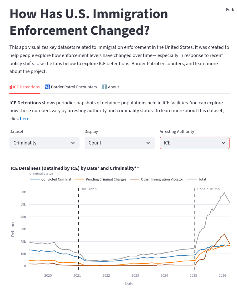
You subset just to the people detained by ICE, look at their criminal status over time, and the percent of them who are convicted criminals [compared to the total number of detainees] just went down at an amazing rate. I think that was interesting. There's a lot of information online that would lead people to expect that, and also a lot of information online that lead people to expect the opposite (that they're only detaining criminals).
I did get to speak to a statistician at CBP, DHS about this because in the data—it was shocking. If you look at the graph, you'll see the number of people being detained by CBP has gone down.
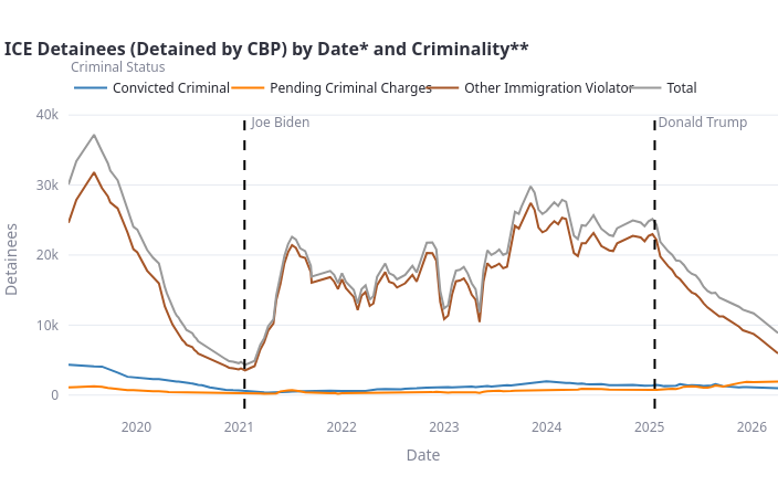
Why? Are they getting lazy? What is this? And the [DHS] statistician said, "Oh, no." He said, " The number of people that cross the southwest land border is directly related to the immigration policy of the United States. All those people now know that Trump doesn't want them here." He said, "We actually publish that data, and you can get it."
I laid it [Southwest Land Border Encounters data] over, and that number goes down to all-time lows. That was an interesting project there, [the Foreign-Born Population Trends project] was the follow-up to that.
It's nice to look at people in ICE detention. That's an interesting way to measure what's actually happening as opposed to just rhetoric. But because of my background in census data, I realized they ask a question [in the ACS], "Were you born in the United States or not?"
We can now set up an infrastructure to see how that population changes going forward, as a response to all these immigration enforcement actions Trump is doing. I believe I have set up that infrastructure already.
These exploratory data analysis tools I think are fascinating.
Can you explain what that means? What makes it “exploratory?”
The [Nativity App] has four data files in it, and they look like this.
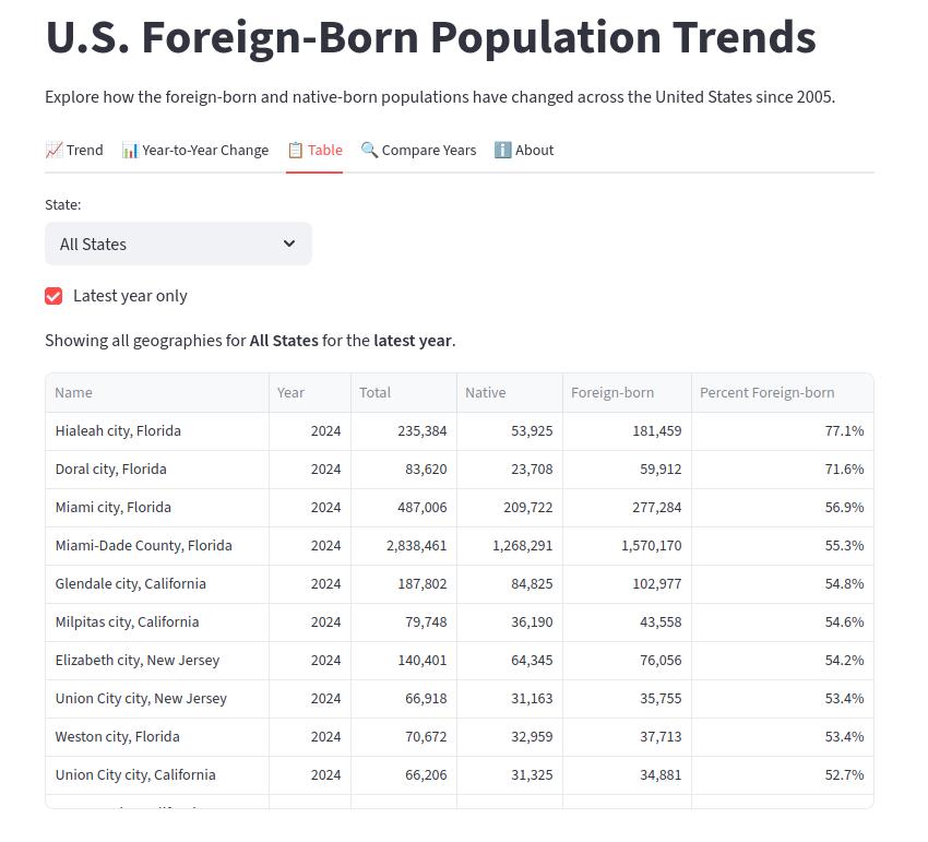
So the columns of state, place name, year, total (meaning total population), number of people who are native-born, foreign-born, percent foreign-born. Exploratory data analysis would be like, “What's the median? What's the average value? What's the biggest? What's the smallest? How did the numbers change over time overall?” When you're dealing with questions like that, it's exploratory data analysis.
This tool is designed to answer those questions. “How did California change? What are the numbers for California for a percent foreign-born?”
It's like getting the general picture of a data set.
Yes. The alternative to that might be, “What's driving these numbers? How about the economic situation in America? How could we tease out causality?” I'm not capable of answering those questions.
I'm not making any claims of causality here. I'm just making it easy for people to see what the actual numbers are. The range of them, how they change over time.
[Establishing causality], that's left up to the rest of us.
Yes, exactly.
The purpose is to set up an infrastructure so that we can see how changes in the foreign-born population unfold during the Trump administration. People might want to avoid [drawing conclusions about] causality, but there are big things happening. We can't see that now because the last year [of available ACS data is from] 2024, but we can see historical trends.
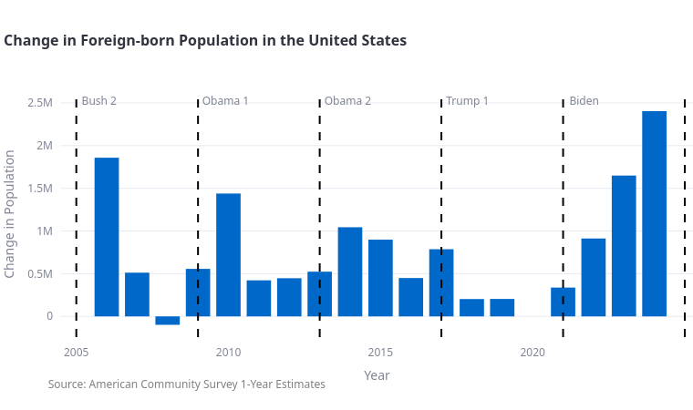
In my opinion, that's interesting to know right now, because people will say, "Maybe that number goes up and down every year, or all the time." But in fact, the ACS starts in 2005, and it's only gone down one year, and that was during the great financial crisis.
I annotated it with administration changes. Initially, I didn't do that. When I spoke to the DHS statistician, he said, "It's silly to avoid doing that because that's where the key changes are."
It's interesting that even during Trump's first administration, the number went up every year we have data for (2020 is missing due to COVID-19—not enough people responded). I think that's a useful thing that isn't mentioned enough. Then Biden has the record, but Bush had the record prior to the last year of the Biden administration. Even that dialogue you see online of “Republicans are against immigration, but Democrats aren’t”—I think that these facts are interesting.
I'm expecting a decrease. We'll see if that happens. When the new data is published in September, I’ll just run a script and then we'll get new data [displayed in the tool]. If you're on my newsletter, you'll know as soon as that happens.
Other things to note while we're here: the percent foreign-born over time.
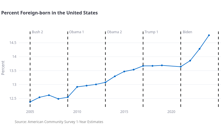
Nationwide, at the start of the ACS, 12.4 % were foreign-born, and then it went all the way up—at the end of Trump I, it was 13.6%, and it went down 0.1%. Then it went up quite a bit under Biden, so that's 1.2 percentage points. But again, you could see this as a time series or bar chart change for every geography.
That's interesting. It looks like quite a big spike under Biden, but really the change is only a percent.
Yeah, 1.2 percentage points.
People are very vocal about these datasets and these graphs. They'll say things like, "You're doctoring the image to make it appear that there's a big change, when in fact it's small." They'll say things like, “It looks like you're saying there's a foreign invasion. You should have the y-axis start at zero.” But if you do that, you'll see no change at all.
And in fact, all statistical software by default will minimize white space. It'll show a little bit of blank below the lowest, a little bit of blank above. They maximize your ability to see change. I'm just using the default parameters. Anyway, that's something to be aware of as well.
This is the standard—to maximize change?
Yes, the default for Plotly [open-source browser-based graphing library].
Changing it, starting from zero like you said, that is more creating a narrative. That would be closer to doctoring?
I tend to start with whatever the standard is, and only change it if there's a point, and then be clear why I'm making the change. That's my approach.
I think that's important to note because, laid out visually, your brain just gets an impression that it's quite a spike. I think it's the responsibility of maybe the journalist, the person telling the story to the public, to point out, “This is because it follows a standard, and if you look, you see it's only one percentage point.” But I think having everyone be aware of the standards, and having [standards] be maintained, is really important.
I think that's very good. Another thing to point out is some people may say 1.2 percentage points is nothing, but it's much larger than Trump I. Obama II was just 0.6 percentage points. There's different ways to compare it, right? You could compare it to past administrations. There's a lot to say there.
This was fun—people always want to know outliers.
America has this tremendous range, as we would say in statistics. I created this to make it easier to look at outliers.
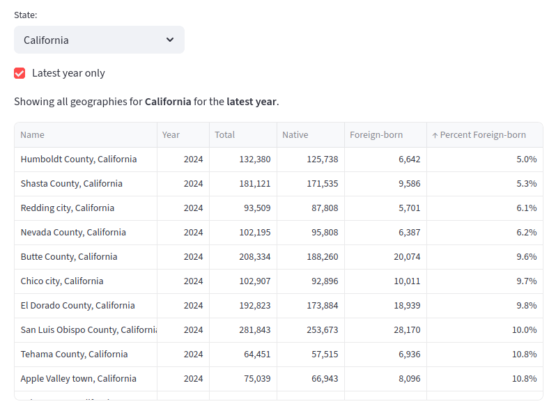
You can subset to your own state, because I was interested in that too. I live in San Francisco, so we're in the state of California. What location has the highest and lowest percent foreign-born? That may interest you.
That's a really useful tool. I like that a lot. Especially as a journalist, I feel like we're drawn to the outlier cases, the really interesting cases.
Absolutely.
And then I wanted to compare years. I think this will be useful with the September update.
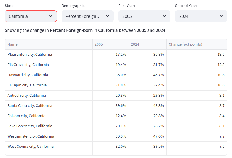
What location (and I use the word “location” to say it could be the country as whole, a state, county, or city) changed the most? So Pleasanton, which is a city in California, increased almost 20 percentage points in terms of the foreign-born. In September, something like this would be interesting.
[To show] what cities were hit hardest by deportation enforcement?
Keep in mind, it's not just deportation enforcement. There's also—academia has a lot of international researchers and a lot of international students. Those visas were cut. I think Trump fought with Harvard especially, and he just removed their ability to get international student visas. And then, of course, there's a perception issue, like maybe America is viewed as less welcoming, so less people would want to be here. There are all sorts of things that could be causing it, and this is just looking at impact.
“Counting people accurately—you would never think that [kind of] impact could come down to such a small number of people...”
We've had different measures removed from federal statistical collections relating to race and ethnicity, and things like gender identity. Do you know if the ACS has had similar changes proposed to it?
I know that the API went down for a while. I know that Kyle Walker [associate professor of Geography at Texas Christian University and spatial data science consultant] was quoted in a Washington Post article about that. A lot of programs have been cut.
There's trickiness because a lot of these programs are congressionally mandated. I don't really know how Congress works at that level. But I've met several people who work at Census over the years. I've spoken at the ACS Data Users Conference about my open source work, for example. I met someone who interned there, and he said, "People at Census are arrogant, because it's the only agency that's defined in the Constitution."
It says like, “There shall be a counting of the people every 10 years,” and that's how the House is divided. It's not discretionary. I know about DOGE and all of that. I don't know the details of how it played out with the ACS or Census.
It has an extra protective layer?
I don't know how it plays out with like—how much power does the executive have? I know that under Trump I, there were lawsuits about the Census Bureau. I think the lawsuit was “Do you count students or not? Do you count students where they reside versus where they're from?” I think that was already asked and answered in litigation, but then they brought it up again.
I think New York lost a seat in the House of Representatives by [about 90] people or something like that in 2020. Counting people accurately—you would never think that [kind of] impact could come down to such a small number of people, but it did.
So I think there's probably always fighting about it. But of course, now it's just a whole different level.
Yeah, we can't take the security of the ACS process for granted, because we can't take anything for granted these days. But it does sound like you are expecting to have this data, at least for 2025 and 2026—the “Were you born in the US?,” question.
Nativity is the technical word they use. I expect the nativity question to absolutely still be there.
I think there's a nuance to that. At points in the past they've asked, "Are you a citizen?" Which they do not ask now, I believe. There's fights about whether they should or shouldn't ask that. But consistently, “Were you born here, or not?,” has always been there.
It seems like that would be useful for the administration's narrative. Although, they also make decisions that make no sense.
Yeah, they might want to boast about that number going down, for example.
Another journalist I spoke to said that there's this question of methodology—how they go about this. They send out a form in the mail, the addresses are selected with a lot of thought. If you don't answer, they send someone to your home to try and knock on your door and get you to answer it, because they pick that address with thought to get the best sampling they can. I'm not a statistician, so I can't speak to that.
But a journalist said, "Maybe there's a lot of foreigners or immigrants who will fear the government and be less likely to answer. So maybe there will be a skew in the data because of that." And I said I can't answer that. But I know that the Census Bureau employs a lot of people to try and address that.
“It seems uncommon to use real, trustworthy numbers... I hope that my work is useful in that way, and I hope that it encourages more people to do similar projects.”
You have the app for the nativity data and the COVID data. Do your other tools have apps? Are you planning on expanding?
I don't know what I'm gonna do next. These started because I was very interested in getting some projects with Python under my belt, and because I had the background in federal data, it seemed like a natural place to start.
My technical skill in Python has improved a lot since I did it, so it made sense to look at redoing stuff as I finished it. The next one is a revamp of the COVID one, and I'm not sure what will happen after that. And there will be an update of the ACS one in September. Those are the only two updates I'm sure about now.
The tools that don't have apps yet, how would you advise people to approach that kind of thing?
I teach a course on how to make apps but it requires some level of Python skill already. My friend Reuven Lerner has an introductory Python course that I highly recommend.
A bit about Reuven, he's got an undergrad in CS from MIT, and then he got a PhD in learning sciences from Northwestern, and he's been teaching programming. He combined them basically by teaching programming, which he's been doing exclusively for decades now. That's all he does every day.
I've known him for 10-plus years. I took his courses, and his introductory Python course, I found to be masterful. It was like, one of the best technical courses I ever took. The amount of lecturing, versus exercises, was perfect. Because he does it every day, the exercises were perfect too. Totally attainable and interesting and relevant.
I wanted to ask if you had a sense of others working in the scene, other open source tools that you could recommend. Who else is working to help researchers?
Kyle Walker is absolutely someone you should talk to. He does both languages (Python and R). Kyle actually has a book on working with census data in R.
And then Darren Vengroff did censusdis. I think he was working at a hedge fund at the time, and they gave him some free time to do volunteer work, and that was his volunteer work.
It seems like you do a fair bit of collaboration. Do you do collaborations [with organizations like] immigrants rights groups, or population researchers, where you are teaching them how to use your tools, and things like that?
Yes, that's the most interesting work for me. All my open source work, that's something I do on my own time for free. I did consulting work, back in my R days. I haven't really done that on the Python stuff yet.
But I would love to work with anyone, any organization, with an interest in this type of work. They should absolutely contact me.
The point of my project is to not only cover the emerging independent research scene, but also connect them with tools to keep their work going. I think there's lots of people out there who would love to know that they can work with you. Where can they find you?
Anyone who wants to work together should email me. My website has a contact button.
Join my newsletter. So if you visit my website, arilamstein.com, and scroll to the bottom, there's an option to sign up to my newsletter. I send out no more than one email a week so it's not very high volume. When I publish an open source package or a web app, that's where I announce it. I often will give people early access to get feedback—it's more interactive than just reading my blog posts. When I'm teaching new courses, I announce it to my newsletter first as well.
What else do the people need to know?
There's a few things that I think people should know. One is that the American Community Survey exists, and they ask a lot of questions that are interesting and relevant. I think more people should be looking to this dataset for facts that relate to the news.
Our public dialogue is filled with a lot of hyperbole, a lot of black-and-white statements. It seems uncommon to use real trustworthy numbers in these conversations. I hope that my work is useful in that way, and I hope that it encourages more people to do similar projects.
Edited for sequencing and clarity.
Newsjunkie. Ari Lamstein, interviewed by Morgan Kriesel, May 6, 2026.
© Newsjunkie.net 2026
The purpose of TRAC is to provide the public with comprehensive information about staffing, spending, and enforcement activities of the federal government.